It's The Scale, Stupid
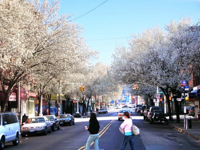
 Fifth Avenue Before
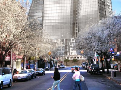
Fifth Avenue After
Important aspects of a project are beyond an architect’s control. Most importantly, the architect does not decide the size of the project. The architect does not set the program, and is therefore challenged with configuring a given amount of building on a provided site. So while it’s one thing to go out and defend a project that you have accepted as a challenge, there is a danger in being hoisted by the developer's petard when taking on a project that is seriously flawed in its conception. Has the intransigence of the developer – in continually asserting a program that is so far beyond a reasonable scale - jeopardized the ability to do a project at all? The Gehry renderings will not help sway public opinion, and the informed design community is all too aware of what lurks behind the curtain here.
We were wary to begin with of a developer with a consistent track record of getting the worst work out of good designers. Now David Caruso in an AP report in Newsday quotes Mr. Gehry: “"What we are trying to do is create a skyline,'' he (Gehry) said, with buildings of different materials and heights, as if they had been developed over time.” As if they had been developed over time! When Frank Gehry is asked to try his hand at post-modern pastiche, it’s the final confirmation that this project is way off track. Why would you want to create new buildings that look “as if” they had been developed over time, when you have real substantial buildings on the site that really have been developed over time? And why would you ask Frank Gehry, of all people, to do that? If you want a fake New York, go to Las Vegas.
Yet the design team has soldered on. In attempting to dismiss critics of the project, Mr. Gehry said: “They should’ve been picketing Henry Ford….there is progress everywhere.” This particular view of progress, in which bigger is always better, and the development of short-term economically tempting models takes precedence over the meaning inherent in the existing built environment, is not shared by us. Though Henry Ford is not one of our heros, and not just for the obvious reasons, we do believe in progress but of a different type. In Brooklyn, we don’t define our urban experience by our relationship to the car. We walk. We take public transit. We bike. And so we experience space differently than those in an automobile culture like L.A. do. Progress, for us, would be recognizing the opportunity to integrate the various transit modes at this site, and design a ground plane for them to coexist, privileging the pedestrian. Mr. Olin claims: “We’re optimists who believe that through our work we ought to make the world better…If you believe in change, there are people who are frightened of it or resist it…The more ambitious the scale, the more daring the project, the more upset some people will always be”. Well, if you were an optimist before Metrotech, if you were an optimist before Atlantic Center, the glass is looking decidedly more empty now. Defining progress as building at an “ambitious scale” just seems so incredibly out of touch.
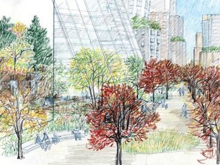
We don’t believe that making the world “better” requires using public subsidies to bail out the purchase of an NBA team (a team that pays players upwards of $10 million each), build a sports venue for 18 to 20 thousand fans and provide parking for 4,000 cars, so they don’t lose their New Jersey fan base, at one of the most congested intersections in Brooklyn - an existing choke-point for traveling between Brooklyn and Manhattan – on the back of affordable housing and the existing scale of a neighborhood. How does ignoring any guidelines provided by existing zoning, providing no alternative energy ideas, no concept of security, privatizing public streets and calling them the project’s “open space”, and proposing a development that totally circumvents the city’s process for public review make the world better? Let’s think some more about what “better” means. What does “better” have to do with an “ambitious” scale? Where are the limits to this ambition?
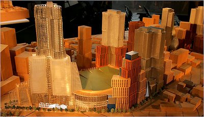
Locating density near mass transit is a good idea, but like all good ideas, it has its limits in real world applications. These limits are provided by other facts, such as the fact that we are not building on a tabla rasa Jeffersonian grid with no history or topography. Brooklyn is not a primordial swamp with a bridge to it from Manhattan. There is an existing world at-grade with a history, a scale, and a host of issues, not the least of which is a surface traffic nightmare. The “progressive” “ambitiously scaled” projects of the 1960s failed, not because they were done in the 60’s, but because interventions, at that scale, in existing fabric, were extremely traumatic to the urban morphology. This project (now 8.66 million sf) would be like locating the former World Trade Center towers (only 7.6 million sf combined) plus Madison Square Garden, somewhere near the W.4th Street Transit Hub because of all the trains there. It is so unfathomably beyond the scale of any reasonable intervention.
Finally, the oft-stated canard: “It has to be big, because of the infrastructure costs.” Not true. Many of the infrastructure costs identified by FCRC are merely a result of the proposed scale of the project, not the other way around. Larger loads come from larger projects. Don’t provide venue parking and you won’t have to excavate for it. Don’t close the streets and you won’t have to relocate sewers and utilities. The city will not accept public utilities under private property, because it requires continual maintenance access to water, storm and sewer, gas and electric lines. The need to relocate utilities is caused by closing the streets. Don’t build so dense and the demands on the infrastructure will be less.
What is the appropriate size for development here? We’ve previously suggested that an FAR of 6 was the intent of the ambitious, progressive, optimistic, and relatively public process of upzoning Brooklyn. An FAR of 6, on an existing site of 825,320 sf (not counting the streets, to make the FAR measure relative to other sites) would result in a total building size of 4,951,920 sf. Don’t provide venue parking, don’t close the streets, provide for intermodal connections, and with significantly reduced infrastructure costs, building under 5 million square feet would be doing the right thing for Brooklyn. And encourage the design team to provide quality design, rather than defend an indefensible program.


